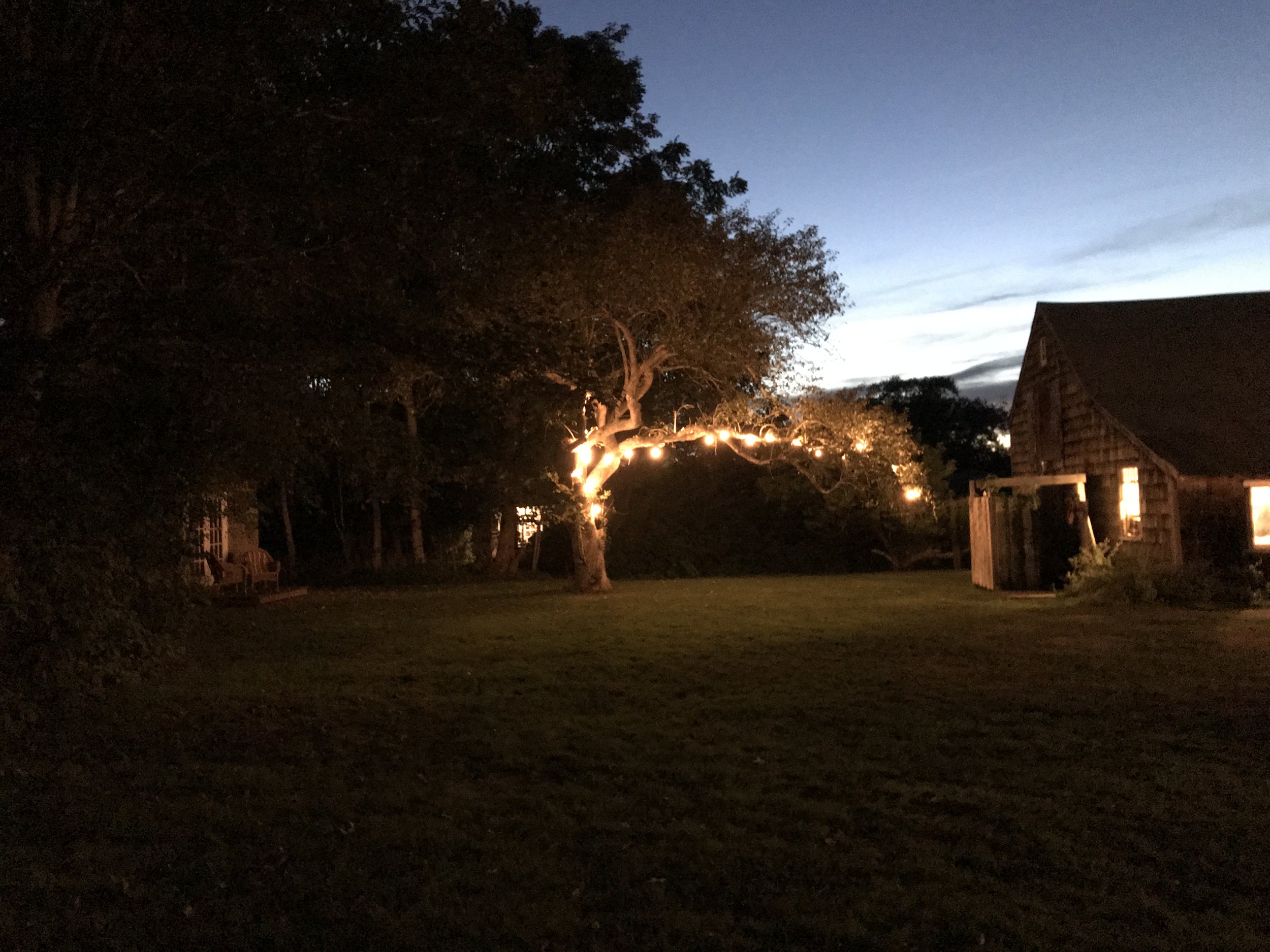
(De)sign of the Times: Adaptive Information Architecture, Larry Wall, Cow-trails and Master-plans

DDJ: Would it be accurate to say that Perl doesn't enforce good design?

LW: No, it does not. It tries to give you some tools to help if you want to do that, but I'm a firm believer that a language -- whether it's a natural language or a computer language -- ought to be an amoral artistic medium.

- "A Conversation with Larry Wall," Dr. Dobbs, 1998

UC Berkeley, user paths. Photo, Peter Merholz

UC Berkeley, user paths. Photo, Peter Merholz

Something that's always struck me about interactive, online design is that, considering the immensely social nature of the medium, it often seems to exist in a bubble — or rather a box. Websites, mobile and iPad applications are all designed and developed by a group of people or individuals usually with the hope of mass consumption. And yet despite all that (hoped for) human traffic, most mass sites feel more like cloistered, master-planned suburbs rather than thriving, ever-changing and evolving cities. 

This...

This...

...Or that? Or somewhere in-between? 

...Or that? Or somewhere in-between? 


Sure, after the early, chaotic days of web design, today's trend toward uber-clean, user-friendly design is a site for sore eyes (that is quite literal and yes, pun intended). But I can't help feeling like we've gone from one extreme to another.

I always think about Myppace versus Facebook. When I was first introduced to the former, I simply couldn't deal with all the flashing, disorganized mayhem. After signing up I rarely returned.

Your space was definitely not My space. 

Your space was definitely not My space. 


Facebook was a breath of fresh air and demonstrated the power of good design on a mass-scale that continues to this day.

Breathe it in. Breathe it in. 

Breathe it in. Breathe it in. 


Huge strides are being made in online design that make the web a far more enjoyable experience. The business community writ large has finally embraced Thomas Watson's good design is good business dictum and all is rosy. 

Thomas Watson and the Motherboard. Good Design is Good Business. 

Thomas Watson and the Motherboard. Good Design is Good Business. 


But I can't help feeling that something is missing. What I've always found so interesting and exciting about urban design, print design, product design — really all design that exists in the physical world — is that its use changes it. Stomp your feet down the sidewalk and the streetscape changes subtly. Flip through a magazine or book and watch the pages take on different patina. Even the laptop I'm typing this on has a few dings that mark it as mine — that give it context, history and depth. 

Planet as Festival, Ettore Sottsass

Planet as Festival, Ettore Sottsass

Of course, web design is a different animal. It is executed in a completely different arena and much of the skills required to master it are completely unique to the space. But then again, many of them aren't. I'm searching for the web equivalent of a high-functioning city. A site designed with amazing infrastructure but one that doesn't come alive (or perhaps even work) without constant use. A site that morphs (not necessarily drastically) and becomes a better, more unique, more exciting place with each visit. A site where you leave your mark without having to leave a comment, upload a photo or share anything at all. 

Much of this stems from growing up in Davis, California where an early design story always stuck with me. When the University of California Davis central quad was designed, key buildings were put in place but no pedestrian, bicycle or automobile pathways were put in place. The designers allowed the users to define the pathways. They relinquished a certain amount of design control, setting sign-posts (history building, science building, art building, agriculture building) but allowing the users to define how to get from here to there. The users played an integral part to how the space would come to be experienced. This wasn't some convoluted user-study. This was organic design at its rarest and best. It was a natural extension and true expression of the users' will. 

Not surprisingly, further research revealed I was far from alone in my thinking. Looking for documentation on my UC Davis story led me to Peter Merholz — founder of Adaptive Path and apparently the person who coined the term blog — and his musings on the user paths at UC Berkeley from 2003. "In a presentation I gave a long time ago on emergent information architecture, I used the first birdseye photo to demonstrate how people will take a planned design and modify it to fit their needs. In the face of this, designers have two choices -- allow the modification, or throw up obstacles (God forbid you digress from the original Vision!)." And Peter's writings ultimately led me to Larry Wall, founder of the Perl programing language. 

Friend and Larry...

Friend and Larry...


Larry's thoughts are remarkable and reminded me very much of my one, true design hero, Ettore Sottsass (more on him later) as far as his openness and willingness to embrace the unknown go.

Ettore Sottsass

Ettore Sottsass


He did throw a bit of a wrench in my works though, concerning UC Davis, as Larry claims to have heard a very similar story about UC Irvine: 

"I am told that when they built the University of California at Irvine, they did not put in any sidewalks the first year. Next year they came back and looked at where all the cow trails were in the grass and put the sidewalks there. Perl is designed the same way. It's not just a random collection of features. It's a bunch of features that look like a decent way to get from here to there. If you look at the diagram of an airline, it's a network. Perl is a network of features... It's more like glue than it is like Legos." 

UC this or UC that, adaptive information architecture (personalization?) is worthy of some serious discussion alongside serious design dialogue. The two are not mutually exclusive. In relinquishing some design control I wouldn't be surprised to find some kind of new online nirvana. Maybe? Maybe. 


Source: http://www.peterme.com/archives/000073.htm...

Designers, step away from your computers: A missive in support of field research

airbnb-design-shop1-670x218.png

When airbnb released its new site design and rebrand by DesignStudio this summer it caused an uproar, to put it mildly. There was so much written about the work that it seemed even the most sheepish designers poked their heads out from behind their monitors to weigh in.

Of course, what was discussed and commented on the most was not actually that interesting. But buried somewhere in all the posts and snarky tweets about genitalia and butts were some enlightening articles written by some well-respected folks. One in particular — “All Your Beds Belong to Us,” by Armin Vit of Under Consideration — was shared and discussed at length amongst a few colleagues and myself.

Vit makes some great points in his article and manages to shift the discussion from the logo to the entire system. I appreciated that. However, there was something else in his piece that caught my attention. Something that I didn’t appreciate. Something that I actually found rather shocking.

In describing how DesignStudio approached the project, Vit explains that part of the studio relocated to airbnb’s San Francisco headquarters from London and four team members even traveled to “13 cities, staying with 18 hosts, across four continents using airbnb.” He goes on to say, “I’m rarely impressed by design firms that go method for a project; I think it’s charming but I really doubt it leads to the mythical insights one expects. Sometimes interviewing a CEO and one lowest-paid employee leads to the right answer in less time and under budget.”

I kept rereading this paragraph and grew increasingly frustrated. It struck me as an all too pervasive attitude in the design world today and a key culprit in the uninspired design that we are forced to contend with on a daily basis. Design — whether product, architectural, graphic or interactive — should not be the result of simply sitting in front of our computer screens, sifting through articles and sites for inspiration and toiling away over indesign, photoshop, illustrator or any other program.

The most effective design — the design that holds the most weight, truly resonates, and is built to last — is more often than not a result of an immersive understanding of a situation, problem or challenge. While the solutions we create, as designers and design thinkers, may reveal themselves in the form of a web site, publication, a building, a product — if successful they are much deeper than just the end result. A successful solution will be layered and complex and will show itself to be a culmination of the varied culture that surrounds it.

In other words, conducting field research that will allow a designer to understand the culture that the challenge arose from isn’t just “charming,” it’s critical. That’s not to say that all projects warrant extensive field research and that all projects that require extensive field research will necessarily be the better for it. But certainly a project the scope of an airbnb redesign requires more than “interviewing a CEO and one lowest-paid employee.” It’s crucial that we remember that design is not just an output and it's definitely not just window dressing. Design is a way of communicating. And you can’t communicate without speaking the language and truly understanding it.

A Productive Past-time...

The "Big Ramp," Davis, California circa 1988

Lately I've been digging through my family's old video footage from the late '80s and early '90s. Some of my favorite stuff was taken at the various skateboard ramps my friends and I built from the ground-up in Davis, California. Seriously, these things were heavy-duty undertakings. Looking back, I'm shocked that they got built and were as good as they were (the "Big Ramp" at least). Sure we had help and encouragement, particularly from the coolest English teacher in the world, Steve Bryant, but we were committed young guns. 

I remember working on that ramp all day and night during one summer. It was such a massive feeling of accomplishment. The thing worked! And not only did it work, it drew some of the best skaters from that era to our weird little out of the way 'burg! In the end, that ramp helped me become a better skateboarder but more than anything it helped me believe that maybe, just maybe, I could do anything. And if I couldn't actually do everything I dreamed of, at the very least, I wasn't ever scared to try. 

We took the skills we acquired building "The Big Ramp" and built smaller, somewhat more complex versions in other parts of town. These ramps became focal points of the thriving Northern California skate scene. Needless to say, watching these videos still sparks a bit of pride and I'm truly honored to have been able to spend so much productive time with so many talented people at such a young age. 

"The Search for Animal Chin"-inspired mini spine ramp, Davis, California circa 1988

Enough with the sentimentality, take a look at the ragged edits I recently put together. Despite their amateurish qualities, I really love them. A lot!